NES Color Palette of Choice

Announce new emulators, discuss which games run best under each emulator, and much much more.

Moderator: General Mods

Post Reply
Gil_Hamilton
Buzzkill Gil
Posts: 4294
Joined: Wed Jan 12, 2005 7:14 pm

Post by Gil_Hamilton »

AspiringSquire wrote:
bitcopy wrote:By TV output do you mean he actually plugged the video output of the NES into his computer (or something) and used software to pickup the colors?
Pretty much. Here's what he says in the readme for 4.0:
BMF wrote:I hooked up my NES to a Snappy video capture device, took a whole bunch of screenshots, and extracted the colors from the screenshots.
Gil_Hamilton wrote:I THINK it was a standalone download, though it may have come with an emulator I was trying.
Was it Nester? I believe that has a black & white mode. No .pal file, though.
I don't think it was NESter.
It was a fullscreen affair with a DOS-style GUI that I used it in. But it MAY have been downloaded seperately(no clue where from, but I downloaded a bunch of palletes once in an attempt to get more accurate emulation, before giving up and just avoiding games that used blue-green)
AspiringSquire
Born to Rule... Impatiently
Posts: 265
Joined: Wed Nov 17, 2004 8:21 pm
Location: Everywhere I want to be.
Contact:

Post by AspiringSquire »

Be the first to experience...

My best palette yet! :D
http://rapidshare.de/files/1860174/ASQ_PAL3.zip.html


~~~Introduction~~~

It turned out that my brightness corrections for the new colors were not as complete as they were supposed to be. The lighter maroon-pink and the darker two of the three new blue-greens hadn't been properly adjusted; this time they have.

The same two blue-greens have also been altered a bit for a different balance of blue and green; they are now slightly more green, and they are the first and only colors to be modified in any way other than brightness. I believe that it now looks more like it should.

Amidst these changes and fixes, I realized that I had no good reason to replace the "bluest bright blue" (with the corresponding color in "BMFPAL50.PAL") in my last revision, so I have swapped it back to the value used in my palette's first release.


See it, play it, and share it. 8)


EDIT: Hmm. I noticed another change that I should have made for this release. The bright pink color, which is related to the maroon-pinks, has been exchanged for the "BMFPAL50.PAL" value. That is all, and there is only a slight difference, so I decided to just re-release this under the same revision number. (Link has been replaced for the updated file.)
[url=http://board.zsnes.com/phpBB2/viewtopic.php?t=3298][color=brown]My [u]NES palette[/u][/color][/url] - better colors with any emulator.

"the more you know, and the more you can do... the more you are."
- [url=http://www.danielbohman.com][color=brown][u]daniel bohman[/u][/color][/url]
kamaitachi
Rookie
Posts: 29
Joined: Thu May 12, 2005 11:22 pm

Post by kamaitachi »

The colors look great. I compared your palette to BMFFINR3.PAL today and I like what I see. I will use your palette from now on. Thanks!
-_pentium5.1_-
Lurker
Posts: 110
Joined: Sat Sep 04, 2004 7:55 pm
Location: USA

Post by -_pentium5.1_- »

I tend to derive my own palettes by mixing existing palettes using complicated weighted averaging formulas. I'll take a look at that palette you mentioned...
This signature intentionally contains no text other than this sentence.
AspiringSquire
Born to Rule... Impatiently
Posts: 265
Joined: Wed Nov 17, 2004 8:21 pm
Location: Everywhere I want to be.
Contact:

Post by AspiringSquire »

Better than the best! (of my own previous palettes)
http://rapidshare.de/files/1922528/ASQ_PAL4.zip.html


Hearkening back to my original concept of only using colors from BMF's palettes, this version replaces the two darker blue-greens yet again. It now utilizes the brightness-adjusted colors from "BMFFINR3.PAL", and it looks even better than before (but the difference is minimal). This _should_ be the last change for those two colors. Hopefully I won't find something else that needs improvement. :P
[url=http://board.zsnes.com/phpBB2/viewtopic.php?t=3298][color=brown]My [u]NES palette[/u][/color][/url] - better colors with any emulator.

"the more you know, and the more you can do... the more you are."
- [url=http://www.danielbohman.com][color=brown][u]daniel bohman[/u][/color][/url]
AspiringSquire
Born to Rule... Impatiently
Posts: 265
Joined: Wed Nov 17, 2004 8:21 pm
Location: Everywhere I want to be.
Contact:

Post by AspiringSquire »

Sorry for making so many versions... :roll:
But I'm pretty satisfied with the way everything looks now. Does anyone care to share their opinion? What do you think of it?
[url=http://board.zsnes.com/phpBB2/viewtopic.php?t=3298][color=brown]My [u]NES palette[/u][/color][/url] - better colors with any emulator.

"the more you know, and the more you can do... the more you are."
- [url=http://www.danielbohman.com][color=brown][u]daniel bohman[/u][/color][/url]
AspiringSquire
Born to Rule... Impatiently
Posts: 265
Joined: Wed Nov 17, 2004 8:21 pm
Location: Everywhere I want to be.
Contact:

Screenshots - Palette in Motion

Post by AspiringSquire »

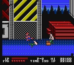
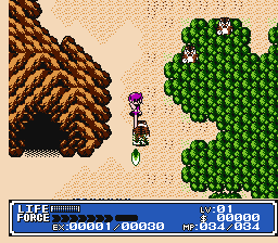
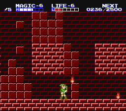
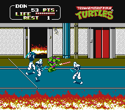
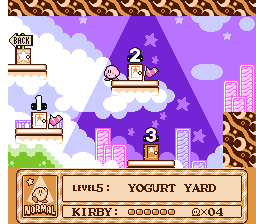
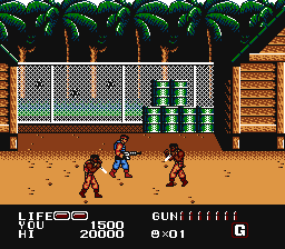
Here are some screenshots of my palette at work. :)

P.O.W. __&&__ Double Dragon
Image ____ Image
Knife vs. Machine Gun... What is the likely outcome?

Crystalis __&&__ Zelda II: The Adventure of Link
Image ____ Image
"The monster is already dead."

Teenage Mutant Ninja Turtles II - The Arcade Game __&&__ Kirby's Adventure
Image ____ Image
Donatello clearly wielding ...a lightsaber.


--------
Screenshots made with ASQUIRE4.PAL, but they may as well have been made with the next version of my palette (the images above would be identical):
http://rapidshare.de/files/2135771/ASQ_PAL5.zip.html
*Note that this is not the most recent version anymore. See the first post in the thread for the palette of today.
Last edited by AspiringSquire on Tue Jun 07, 2005 7:19 am, edited 4 times in total.
[url=http://board.zsnes.com/phpBB2/viewtopic.php?t=3298][color=brown]My [u]NES palette[/u][/color][/url] - better colors with any emulator.

"the more you know, and the more you can do... the more you are."
- [url=http://www.danielbohman.com][color=brown][u]daniel bohman[/u][/color][/url]
Agozer
16-bit Corpse | Nyoron~
Posts: 3534
Joined: Sun Aug 01, 2004 7:14 pm
Location: Nokia Land

Post by Agozer »

I need to play Kirby again... Looks nice btw.
whicker: franpa is grammatically correct, and he still gets ripped on?
sweener2001: Grammatically correct this one time? sure. every other time? no. does that give him a right? not really.
Image
kieran_
Mugwump
Posts: 824
Joined: Fri Jul 30, 2004 9:05 pm

Post by kieran_ »

This is pretty cool work. Maybe you should have it hosted on Zophar, and other emu sites? Or maybe even get in contact with NES emu developers and have the pallette included in their emulators?
LobStar
Lurker
Posts: 189
Joined: Tue Dec 14, 2004 3:43 pm
Location: Corlo Island
Contact:

Post by LobStar »

AspiringSquire wrote:Here are some screenshots of my palette at work. :)

Crystalis
Image
Those all look great except for the status menu back color in chrystalis, for some reason it seems off, I can try and load it up on my NES and compare it if youd like.
... Ever take a look at the Earthbound ROM? I SWEAR THE PROGRAMMERS WERE ON CRACK WHEN THEY DID IT! JUST LOOK AT IT!
AspiringSquire
Born to Rule... Impatiently
Posts: 265
Joined: Wed Nov 17, 2004 8:21 pm
Location: Everywhere I want to be.
Contact:

Post by AspiringSquire »

LobStar wrote:Those all look great except for the status menu back color in chrystalis, for some reason it seems off, I can try and load it up on my NES and compare it if youd like.
You can go ahead and compare, but it looks good to me (I own the game too; Crystalis is one of my very favorites). TV displays vary from PC monitors enough that it may be the cause of the difference you think you notice. Also, the colors look slightly different when they are viewed in fullscreen rather than at this small size. Try enlarging the picture, and see what you think of it.
[url=http://board.zsnes.com/phpBB2/viewtopic.php?t=3298][color=brown]My [u]NES palette[/u][/color][/url] - better colors with any emulator.

"the more you know, and the more you can do... the more you are."
- [url=http://www.danielbohman.com][color=brown][u]daniel bohman[/u][/color][/url]
LobStar
Lurker
Posts: 189
Joined: Tue Dec 14, 2004 3:43 pm
Location: Corlo Island
Contact:

Post by LobStar »

ill try that when I get home, if I did it here, the mac would crash lol. I have to say though, Chrystalis is also one of my absolute favorite games as well. Ill have my friend bring over her TV card and i'll hook my NES up to it and snag a photoshop hex value, just to be sure. that small though, it seems too dark and rich, I seem to remember it being slightly brighter, a little more washed out on a TV, but then again, NTSC does favor alot more red.....
... Ever take a look at the Earthbound ROM? I SWEAR THE PROGRAMMERS WERE ON CRACK WHEN THEY DID IT! JUST LOOK AT IT!
AspiringSquire
Born to Rule... Impatiently
Posts: 265
Joined: Wed Nov 17, 2004 8:21 pm
Location: Everywhere I want to be.
Contact:

Post by AspiringSquire »

kieran wrote:This is pretty cool work. Maybe you should have it hosted on Zophar, and other emu sites? Or maybe even get in contact with NES emu developers and have the pallette included in their emulators?
Thanks, kieran. :)
That would be mighty fine, but how would they be convinced to host it or include it in their emulator? I'm not so great at talking my way into things... And I also fear rejection. :roll: Although, the anticipation of rejection (when waiting for a response) is often worse than the rejection itself.

So... I'd sort of rather wait for them to discover my palette instead of marketing it to them. :P

Any suggestions?
[url=http://board.zsnes.com/phpBB2/viewtopic.php?t=3298][color=brown]My [u]NES palette[/u][/color][/url] - better colors with any emulator.

"the more you know, and the more you can do... the more you are."
- [url=http://www.danielbohman.com][color=brown][u]daniel bohman[/u][/color][/url]
xamenus
Veteran
Posts: 907
Joined: Fri Jul 30, 2004 12:26 am

Post by xamenus »

AspiringSquire wrote:Any suggestions?
You could visit http://nesdev.parodius.com/ and let them know about it. This is the most popular site that NES emu authors visit for technical info for the NES. Demos and palettes are hosted here as well.
Nightcrawler
Romhacking God
Posts: 922
Joined: Wed Jul 28, 2004 11:27 pm
Contact:

Post by Nightcrawler »

AspiringSquire wrote:
LobStar wrote:Those all look great except for the status menu back color in chrystalis, for some reason it seems off, I can try and load it up on my NES and compare it if youd like.
You can go ahead and compare, but it looks good to me (I own the game too; Crystalis is one of my very favorites). TV displays vary from PC monitors enough that it may be the cause of the difference you think you notice. Also, the colors look slightly different when they are viewed in fullscreen rather than at this small size. Try enlarging the picture, and see what you think of it.
That's what I was going to say. The color setting on your monitor can alter the intended palette colors. It's very difficult to do a very accurate comparison.
[url=http://transcorp.romhacking.net]TransCorp[/url] - Home of the Dual Orb 2, Cho Mahou Tairyku Wozz, and Emerald Dragon SFC/SNES translations.
[url=http://www.romhacking.net]ROMhacking.net[/url] - The central hub of the ROM hacking community.
LobStar
Lurker
Posts: 189
Joined: Tue Dec 14, 2004 3:43 pm
Location: Corlo Island
Contact:

Post by LobStar »

Enlargment didn't help, still seems too rich. I'll compare them later today.
... Ever take a look at the Earthbound ROM? I SWEAR THE PROGRAMMERS WERE ON CRACK WHEN THEY DID IT! JUST LOOK AT IT!
AspiringSquire
Born to Rule... Impatiently
Posts: 265
Joined: Wed Nov 17, 2004 8:21 pm
Location: Everywhere I want to be.
Contact:

Post by AspiringSquire »

LobStar wrote:Enlargment didn't help, still seems too rich. I'll compare them later today.
I think it may make all the difference if you adjust the brightness of your monitor. TVs are usually set to a higher brightness than PC monitors, so most of the colors may seem a bit darker, or too "rich".
[url=http://board.zsnes.com/phpBB2/viewtopic.php?t=3298][color=brown]My [u]NES palette[/u][/color][/url] - better colors with any emulator.

"the more you know, and the more you can do... the more you are."
- [url=http://www.danielbohman.com][color=brown][u]daniel bohman[/u][/color][/url]
LobStar
Lurker
Posts: 189
Joined: Tue Dec 14, 2004 3:43 pm
Location: Corlo Island
Contact:

Post by LobStar »

already have, checking on both the mac at work (SUPERB monitor) and my crappy monitor at home, the color still looks far too rich, still looking for my RF switch to check it on my tv though. then ill try the tv card.
... Ever take a look at the Earthbound ROM? I SWEAR THE PROGRAMMERS WERE ON CRACK WHEN THEY DID IT! JUST LOOK AT IT!
LobStar
Lurker
Posts: 189
Joined: Tue Dec 14, 2004 3:43 pm
Location: Corlo Island
Contact:

Post by LobStar »

well I was wrong to a point, the blue is definatly that rich, however, it is indeed a bit brighter. im having problems capturing the overlay but im going to see what I can do about it. in the mean time, stay tuned ^^;
... Ever take a look at the Earthbound ROM? I SWEAR THE PROGRAMMERS WERE ON CRACK WHEN THEY DID IT! JUST LOOK AT IT!
BootGod
Rookie
Posts: 24
Joined: Sun Oct 24, 2004 8:44 pm

Post by BootGod »

The palette looks great but it is actually quite a bit off on a lot of colors. The problem is that BMF used colors taken off screen caps, and they do indeed match them very well, but what the tv cards output is not the same as what a TV would do. I have 2 different capture cards with different chipsets and they both try to auto-calibrate the color/brightness etc (I think all of them do). While that works pretty good on normal video, on computer generated stuff it doesn't work so hot. It ends up with the hue being all shifted off, and unforuntely not in an even way.

I recently color calibrated both my TV and monitor as close as I could get them and eyeballed my own palette. Unforunately I forgot to save my last set of changes to it so I have to do a little bit over again. But the results were great. I'm not claiming its perfectly accurate, but very close. When I get a chance to finish it, I will put it up here and let you guys see what you think.

A good example of where BMF's palette and hence yours is a bit off is Maniac Mansion.

I don't mean to rain on your parade, your palette does look very good in most cases regardless. Once I get mine finished (again) I'll let you decide. I have ~200 NES games (damn you Ebay), so I did pretty extensive checking :)
Phil
Rookie
Posts: 21
Joined: Thu Aug 26, 2004 3:24 am

Post by Phil »

Nice work. I am using it right now.
AspiringSquire
Born to Rule... Impatiently
Posts: 265
Joined: Wed Nov 17, 2004 8:21 pm
Location: Everywhere I want to be.
Contact:

Post by AspiringSquire »

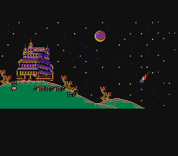
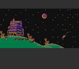
Does this look better?

Image
Maniac Mansion -- update


Image
Maniac Mansion -- "ASQUIRE4.PAL"

I had forgotten about one swap I made for my initial palette release; I inserted a dark grey in place of one of the (identical) quasi-blacks because "BMFPAL50.PAL" had it that way. It looked good in the palette viewer, but maybe I should have realized that it probably wouldn't be right since it was the only one of BMF's palettes (except for "BMFPAL51.PAL", which was a direct revision of the other) to have that as a dark grey instead of 'black'.

Looks to me like I should offer my palette with this corrected color (reverted to match the other quasi-blacks). Do those familiar with the game depicted above agree with the change?
[url=http://board.zsnes.com/phpBB2/viewtopic.php?t=3298][color=brown]My [u]NES palette[/u][/color][/url] - better colors with any emulator.

"the more you know, and the more you can do... the more you are."
- [url=http://www.danielbohman.com][color=brown][u]daniel bohman[/u][/color][/url]
AspiringSquire
Born to Rule... Impatiently
Posts: 265
Joined: Wed Nov 17, 2004 8:21 pm
Location: Everywhere I want to be.
Contact:

New version: ASQ_PAL5.zip

Post by AspiringSquire »

See it for yourself:
http://rapidshare.de/files/2135771/ASQ_PAL5.zip.html

Only the one color change: the dark grey to quasi-black. Tell me if it's better, what it affects, etc.

Enjoy.

EDIT: New zip (and link) due to a minor fix in the Readme.
Last edited by AspiringSquire on Thu Jun 02, 2005 8:18 pm, edited 1 time in total.
[url=http://board.zsnes.com/phpBB2/viewtopic.php?t=3298][color=brown]My [u]NES palette[/u][/color][/url] - better colors with any emulator.

"the more you know, and the more you can do... the more you are."
- [url=http://www.danielbohman.com][color=brown][u]daniel bohman[/u][/color][/url]
BootGod
Rookie
Posts: 24
Joined: Sun Oct 24, 2004 8:44 pm

Post by BootGod »

That was one of the most obvious ones yes. But many of the other colors are wrong as well. Maybe I can bring myself to finishing my version tonight and I can show you exactly what I mean.
Post Reply