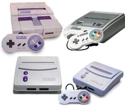
Japanese SFC vs American SNES
Moderator: General Mods
Japanese SFC vs American SNES
One thing I never understood was the decision to use a different design for the USA SNES. I actually would like to know what Nintendo's thinking was behind this. Seems rather retarded, looking back...
Japan/Europe:
USA:
Japan/Europe:
USA:
-
- Seen it all
- Posts: 2302
- Joined: Mon Jan 03, 2005 5:04 pm
- Location: Germany
- Contact:
Maybe the colorful look would have been too "childish" for the US market?
vSNES | Delphi 10 BPLs
bsnes launcher with recent files list
-
- ZSNES Developer
- Posts: 6747
- Joined: Tue Dec 28, 2004 6:47 am
I've heard anecdotal statements about this, but for those with the SFC design please answer this... is is possible to successfully set an open beer or soda can on it?
It looks like the eject button is the perfect place to put the concave surface of the bottom of the can. Or without a game in it, even looks like two cans can fit on it side-by-side over the slot.
Because it is not an easy task on the US one.
It looks like the eject button is the perfect place to put the concave surface of the bottom of the can. Or without a game in it, even looks like two cans can fit on it side-by-side over the slot.
Because it is not an easy task on the US one.
yeah the Super Famicom has more sex appeal.
I like the name better, I like the logo better, and I like the look and feel better.
I guess I might be biased as I grew up with one though.
and yes you can set a beer on it, but the back would be a better place than the front because the back is flat. (behind the cartridge slot as apposed to in front of by the buttons)
plus it had more add ons released for it
I never understood that either, like even if they wanted to change the color scheme in the states that is fine, but when you change the console shape, you just made it a lot harder on yourself to support new hardware add-ons coming out of japan, I guess with piracy that was the idea even the the most piracy was done throughout asia and down into where I lived around Aussie, not in the states.
plus if you had to pick any one color to go with besides rainbow, why choose purple and sick purple? I so would have gone with one decent color. it could have been red, you know "Now you're playing with Power!" and all that stuff.
[quote="byuu"]Seriously, what kind of asshole makes an old-school 2D emulator that requires a Core 2 to get full speed? [i]>:([/i] [/quote]
Or that Americans "are childish" and would be too confused by four different colored buttons.creaothceann wrote:Maybe the colorful look would have been too "childish" for the US market?
Anyway, what the hell is it about purple that pisses me off even more? They gave us PURPLE? Maybe I should just ask what can be done to the design to possibly make it any uglier. Pink controller cords? Oh, and I love how our plastic turns yellow. Is it sunlight or just air that our SNES hates?
I didn't mind the purple. It set it apart from the grey-box NES. And the black as sin Genesis. :PFitzRoy wrote:Or that Americans "are childish" and would be too confused by four different colored buttons. :)creaothceann wrote:Maybe the colorful look would have been too "childish" for the US market?
Anyway, what the hell is it about purple that pisses me off even more? They gave us PURPLE? Maybe I should just ask what can be done to the design to possibly make it any uglier. Pink controller cords? Oh, and I love how our plastic turns yellow. Is it sunlight or just air that our SNES hates?
Basically the plastic combines with oxygen (rusts). Apparently one plant was more generous with the stabilizer. Conspiracy theory: That one plant left out the stabilizer.
It's stupid how parts from two plants were randomly mixed. My bottom shell is that ugly brown, but the top is not. I guess I'm luckier than most.
-
- "Your thread will be crushed."
- Posts: 1236
- Joined: Wed Jul 28, 2004 1:49 am
- Location: Not in Winnipeg
- Contact:
As far as the design goes, you have to look back to Nintendo's decision to market the NES in the US. Back then, people hated video games in the wake of the Atari disaster. So, Nintendo changed the design of the NES to make it look more like something you would include in your entertainment unit (the Famicom looked very much like a toy). I am guessing that NOA also though the Super Famicom looked too much like a toy and decided to redesign it.
<pagefault> i'd break up with my wife if she said FF8 was awesome
that's kind of odd, because to me clunkiness = cheap toy, smooth and sexy = sophisticated piece of machinery, and the whole 4 color logo was a total add for how this console could produce the most vibrant colors on the market.
I think the US peeps just wanted to make it as cheap as possible to manufacture and incompatible for import gaming. It wouldn't surprise me in the least.
[quote="byuu"]Seriously, what kind of asshole makes an old-school 2D emulator that requires a Core 2 to get full speed? [i]>:([/i] [/quote]
That's probably the most historically accurate reason I've heard yet, though I agree with Panzer that the Super Famicom never personally struck me as a toy-like design. The rounded corners and subtle curves just look better to me, and the four-blob color logo is badass.badinsults wrote:As far as the design goes, you have to look back to Nintendo's decision to market the NES in the US. Back then, people hated video games in the wake of the Atari disaster. So, Nintendo changed the design of the NES to make it look more like something you would include in your entertainment unit (the Famicom looked very much like a toy). I am guessing that NOA also though the Super Famicom looked too much like a toy and decided to redesign it.
On a similar note, I've had to clean a lot of SNES carts lately, and I absolutely hate the pitted lines that run across American cartridges, not to mention the graininess of the plastic that tends to hold dirt better. I've had to clean so much shit out of these carts... thank god Nintendo eventually wised up about stuff like this and went for simpler and simpler designs.
I also agree that generation 2 looked better, more importantly for us. The power/reset buttons are kind of stupid, though.
Last edited by FitzRoy on Mon Oct 15, 2007 4:26 am, edited 1 time in total.
-
- Hero of Time
- Posts: 2646
- Joined: Fri Jul 30, 2004 2:49 am
- Location: In front of the monitor
- Contact:
Wasn't the beer or soda can thing related to the NES? Wasn't that why the NES looked so much different than its Japanese counter-part (aside from the entertainment unit reason)?whicker wrote:I've heard anecdotal statements about this, but for those with the SFC design please answer this... is is possible to successfully set an open beer or soda can on it?
Uhm. no. The NES hold beverages on top quite well. Almost too well. You *don't* want people to spill liquids in it.snkcube wrote:Wasn't the beer or soda can thing related to the NES? Wasn't that why the NES looked so much different than its Japanese counter-part (aside from the entertainment unit reason)?whicker wrote:I've heard anecdotal statements about this, but for those with the SFC design please answer this... is is possible to successfully set an open beer or soda can on it?
Nintendo Power talked about how the NES case was designed to look sleek and not at all like a toy. I don't recall much being said about the SNES case. On or about that time there was a little blurb with a picture in the corner hinting at a "Super" NES with a picture of a 5A22 CPU chip.
-
- ZSNES Developer
- Posts: 6747
- Joined: Tue Dec 28, 2004 6:47 am
ha, sleek, that's awesome, I'll have to remember that. Then again it WAS the 80swhicker wrote: Nintendo Power talked about how the NES case was designed to look sleek and not at all like a toy.
[quote="byuu"]Seriously, what kind of asshole makes an old-school 2D emulator that requires a Core 2 to get full speed? [i]>:([/i] [/quote]
Re: Japanese SFC vs American SNES
Meh. There's not much to understand I guess. Just some half big shot marketing guy/team at the time probably decided that "Given the US market, our research shows that this design will boost our sales 960%" or something like that.FitzRoy wrote:One thing I never understood was the decision to use a different design for the USA SNES. I actually would like to know what Nintendo's thinking was behind this. Seems rather retarded, looking back...
Japan/Europe:
http://img84.imageshack.us/img84/5236/s ... comeq0.jpg
USA:
http://img135.imageshack.us/img135/1144 ... icauv8.jpg
No, what you REALLY should not understand is why the companies had the systematic compulsion to turn the Japanese artbox:
and turn it into THIS monstrosity:
and this was true for nearly EVERY game released.
Other times they just took the great artwork
and turn it into something extremely bland:
Last edited by Snark on Mon Oct 15, 2007 4:34 am, edited 2 times in total.
Yeah, the SFC boxes were sweet. The covers were all about the artwork. Remember how Final Fantasy IV and VI were renamed to II and III for us and giving us shittier cover art? They finally stopped doing that at VII, but the damage had already been done. Unless you're talking to a heavy gamer, they'll always think you're talking about the SNES versions when you reference II and III.
Not to mention the M. Bison and Balrog switcheroo. I still confuse my friends when I call the boxer Balrog.
Nowadays though, I think there's not much differences between regions, which makes it all the more sweet to own some of the Japanese SFamicom gamesFitzRoy wrote:Yeah, the SFC boxes were sweet. The covers were all about the artwork. Remember how Final Fantasy IV and VI were renamed to II and III for us and giving us shittier cover art? They finally stopped doing that at VII, but the damage had already been done. Unless you're talking to a heavy gamer, they'll always think you're talking about the SNES versions when you reference II and III.
I think by now most gamers familiar with the FF serie understand that 2 games were not released (initially at least) outside Japan amd the whole subsequent number change thing though.
Oh ya...If you're gonna copy a real live boxer, might as well change the name altogether in the US...instead of just doing a name switch between characters...talk about lazy lolNot to mention the M. Bison and Balrog switcheroo. I still confuse my friends when I call the boxer Balrog.
For those who don't know the story:
In Japan: the evil Shadowloo/guy in red is named Vega and the boxer is M.Bison
Outside Japan: Shadowloo guy is M.Bison and boxer is Balrog
The reason for that is that, In Street Fighter (1) the boxer character is actually in fact a direct ripoff of Mike TYson (Tyson --> Bison)
When the game was imported outside Japan to avoid potential lawsuit or something, they just did a namechange.
Oh yeah, and I have a theory that, again, in the original Street Fighter (1) Ken is actually a ripoff of Shin of Hokuto No Ken Aka Fist of the North Star...(and maybe Ryu = Kenshiro???)
Kenshiro VS Shin lol
Ok it's a strech but definitely a possibillity: For those that dont believe me check http://en.wikipedia.org/wiki/Final_Fight#Enemies
Capcom was not particularly imaginatives when it came to original characters design back then...
/thread hijack over
-
- Seen it all
- Posts: 2302
- Joined: Mon Jan 03, 2005 5:04 pm
- Location: Germany
- Contact:
Re: Japanese SFC vs American SNES
Sex sells?Snark wrote:No, what you REALLY should not understand is why the companies had the systematic compulsion to turn the Japanese artbox:
http://img87.imageshack.us/img87/2629/71838bc3.jpg
and turn it into THIS monstrosity:
http://img80.imageshack.us/img80/3625/6b8fw1.jpg
vSNES | Delphi 10 BPLs
bsnes launcher with recent files list
Re: Japanese SFC vs American SNES
I'd say one would have, even as a 13 years old, to be seriously horny to get excited when seeing some badly drawn picture of a woman...creaothceann wrote:Sex sells?Snark wrote:No, what you REALLY should not understand is why the companies had the systematic compulsion to turn the Japanese artbox:
http://img87.imageshack.us/img87/2629/71838bc3.jpg
and turn it into THIS monstrosity:
http://img80.imageshack.us/img80/3625/6b8fw1.jpg
Nah, most US artwork conversions didn't have any scandily dressed woman added to the background or anything most of the time, they were just awfully done.
The emphasis seem to be on more vivid (but ultimately ugly) colors in the US versions I noticed. edit: Also notice the SUPER NINTENDO written all over the US one whereas the 'Super Famicom' is much more humble in the Japanese version.
edit2: Also......
Ryu is knocked out in the Us version....WTFOMGBBQWERETHEYTHINKING???
Seriously, yeah it's pretty awful allright lol
-
- Hero of Time
- Posts: 2646
- Joined: Fri Jul 30, 2004 2:49 am
- Location: In front of the monitor
- Contact:
Hmm, thanks for clearing that up.whicker wrote:Uhm. no. The NES hold beverages on top quite well. Almost too well. You *don't* want people to spill liquids in it.snkcube wrote:Wasn't the beer or soda can thing related to the NES? Wasn't that why the NES looked so much different than its Japanese counter-part (aside from the entertainment unit reason)?whicker wrote:I've heard anecdotal statements about this, but for those with the SFC design please answer this... is is possible to successfully set an open beer or soda can on it?
Nintendo Power talked about how the NES case was designed to look sleek and not at all like a toy. I don't recall much being said about the SNES case. On or about that time there was a little blurb with a picture in the corner hinting at a "Super" NES with a picture of a 5A22 CPU chip.
-
- Seen it all
- Posts: 2302
- Joined: Mon Jan 03, 2005 5:04 pm
- Location: Germany
- Contact:
Re: Japanese SFC vs American SNES
Hey, this was before the internet tubes were laid.Snark wrote:I'd say one would have, even as a 13 years old, to be seriously horny to get excited when seeing some badly drawn picture of a woman...
Anyway - the US cover shows more action; the original cart art is quite static in comparison.
vSNES | Delphi 10 BPLs
bsnes launcher with recent files list