With the new tab feature for the video window working, I thought the video filter window could use a face lift. My problem with the older one was how checking certain options unchecked others unexpectedly. I've rearranged the checkboxes into a more intuitive layout so that similiar options are grouped together. With this new layout, having only one filter enabled now makes sense (Since Filters are clearly separated from things like V-Sync and Hi-Res Mode).
Anyway, the old is on the left, new on the right. Let me know what you think.
Last edited by daft on Fri Mar 31, 2006 1:08 am, edited 1 time in total.
I have a feeling that the video page is going to get re-organized.
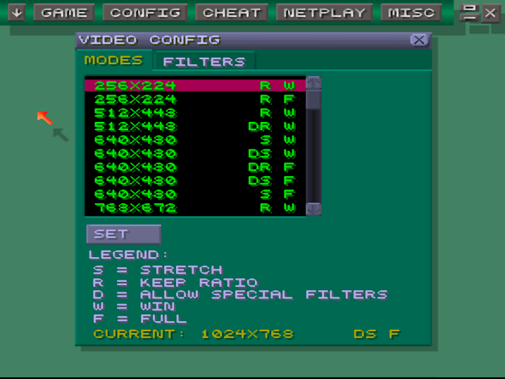
You can clearly see how the original video options page was hacked in half to create the new Modes and Filters tabs. I'm sure these pages will be cleaned up in the future.
My wishlist:
Filters tab be renamed to "Options" tab, or have the non-filter options move back to the "Modes" tab.
The filters should be in a radio-button list, to show that only one of them can be selected at a time. Special filters (NTSC) that do not accept other options (like scanlines) should be separated from the list of normal filters. Other miscellaneous options should be in their own area.
See the Devices options page for an example of radio-button lists.
The "Filter GUI" option might do well to move to the Video options page.
Jipcy wrote:The filters should be in a radio-button list, to show that only one of them can be selected at a time.
This can't be done for several reasons:
- Scanlines are compatible with Interpolation.
- Bilinear filter (SDL) is compatible with all but NTSC (as of now - will likely change)
- GUI radio buttons only work with a specific variable-side setup. Would require a serious code overhaul (I don't specifically have anything against it, it's just a warning that this change requires more than just "use radio instead of checkboxes").
grinvader wrote:
- GUI radio buttons only work with a specific variable-side setup. Would require a serious code overhaul (I don't specifically have anything against it, it's just a warning that this change requires more than just "use radio instead of checkboxes").
That's too bad. The radio button idea makes sense and would be a lot more intuitive than checkboxes. Oh well.
grinvader wrote:- GUI radio buttons only work with a specific variable-side setup. Would require a serious code overhaul (I don't specifically have anything against it, it's just a warning that this change requires more than just "use radio instead of checkboxes").
That's fine. Just a wishlist.
Obviously lots of things could be done to the GUI to improve it. I'm thankful it's as good as it is already.
The fact that it dynamically shows/hides options according to other options, and that it's cross-platform, makes it plenty impressive as is.
The controls are looking good man. Think you can make the words in the menus a little smaller like in the game launcher thingy? It's kinda hard to read my folders and stuff with long names.
MaduinTheMarauder wrote:Think you can make the words in the menus a little smaller like in the game launcher thingy?
Err ?
Nothing's smaller. Everything is 5x5. Please make sense.
Maybe he's talking about the directory tree on the right side of the Load window.
Maduin: (almost?) all of the text in the GUI is as small as it can get. 5x5 pixels is the smallest dimensions you can use to legibly represent all the (capital) letters of the English alphabet. They just look big because the screen containing them is small (256x224?).
Mostly it's the folders names that get cut off and only shows like 5 letters and then splat... nothing else. Maybe the directory selectory thingy could be widened a bit?